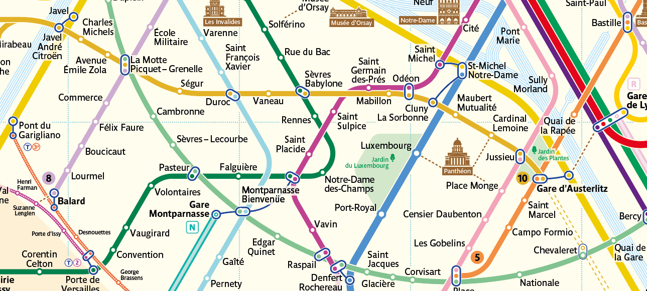
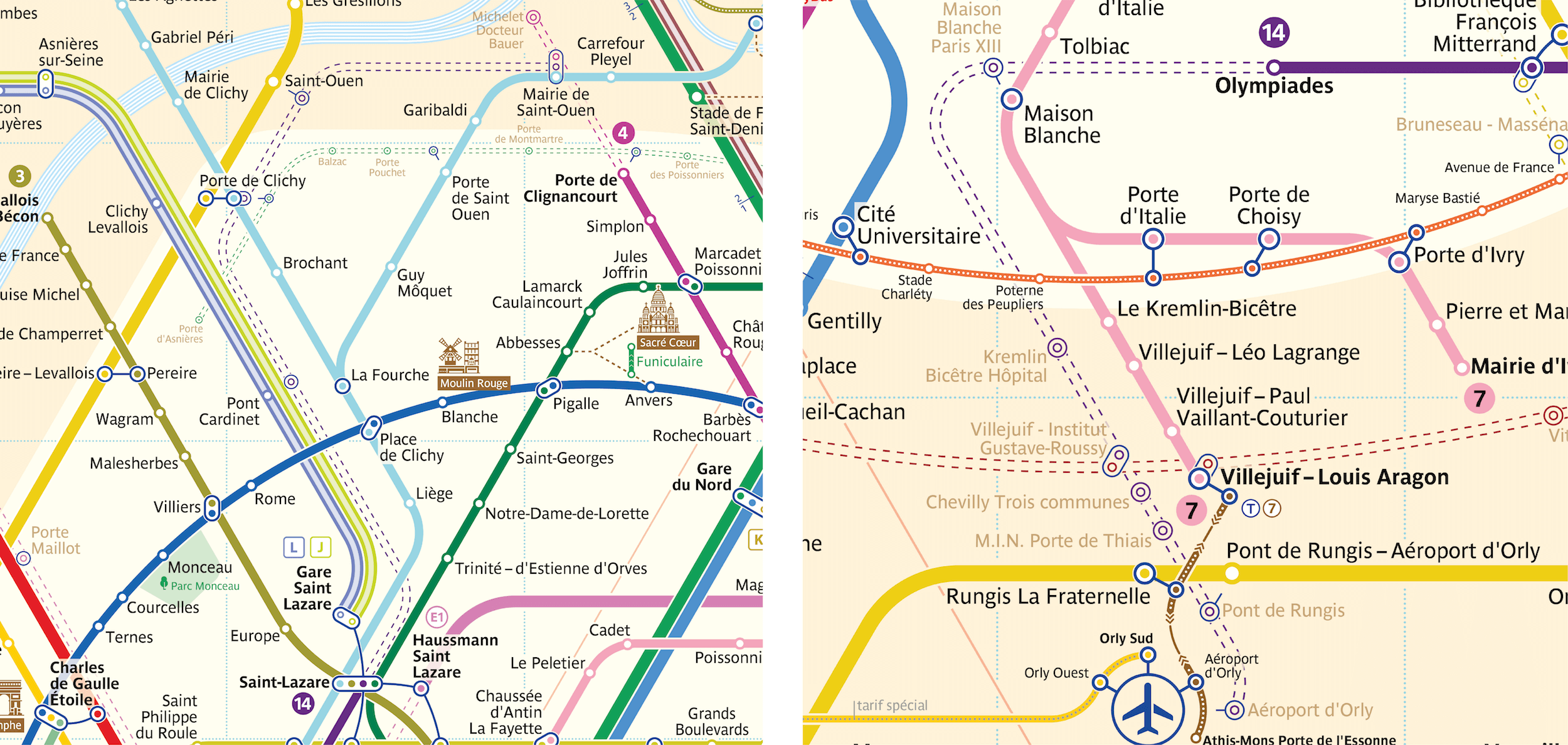
When I first visited Paris, it took me a while to get oriented and put together a route using the official map of the Paris metro. That’s all it took to spark the flame inside me to redraw it according to an entirely different set of principles. The goal was extremely ambitious, but why not try? In this article, I will attempt to describe the principal solutions involved in the development of my own version of the Paris metro map. But for a moment, I’ll just jump ahead to the result:
当我第一次去巴黎的时候,巴黎地铁的官方地图让我花了不少时间才找准方向,拼凑出路线。这激起我内心的小火苗,让我想用一种完全不一样的规范来重画它。这目标比较宏大,但何乐而不为呢?在这篇文章中,我会尝试去描述我绘制巴黎地图的解决方案。在开始之前,先看看我的设计成果:
(Image: metromap.fr) (View large version)
I am unable to discuss the entire process that went into the creation of this new map, because it took me around two and a half years to complete, and an article of that length would bore even the most committed of readers. In this light, I will cover only the principal graphical solutions. At the end of the report, I have included a time-lapse video of the entire creation process.
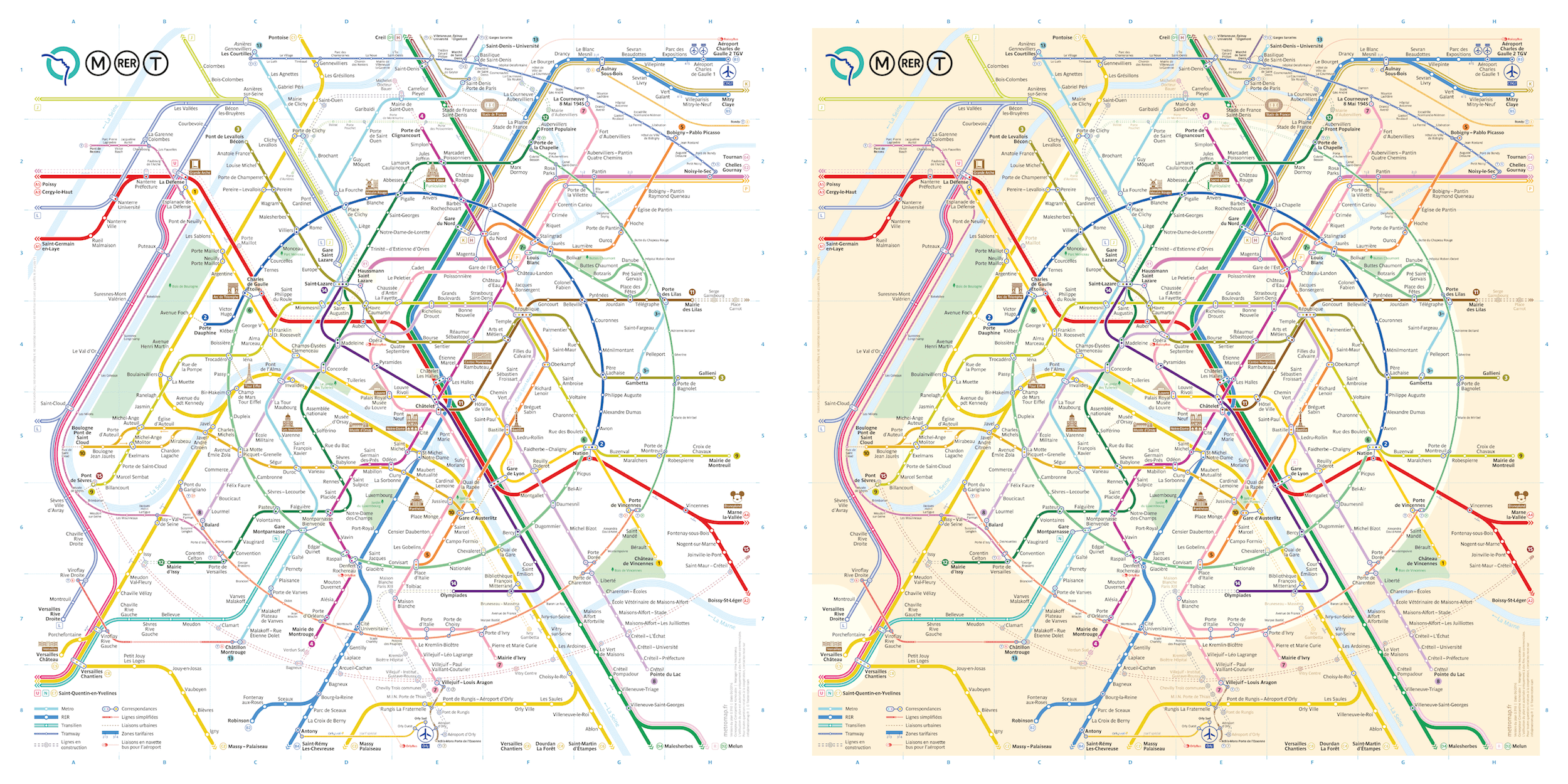
For comparison, this is the current official map.
我没办法谈到创建这张新地图的整个过程,因为整个过程花了我将近两年半的时间,如果都写进去的话,会让最感兴趣的读者都觉得无聊。所以在此,我只会介绍关于图形的解决方法。
Indeed, its appearance is rather forbidding. There are numerous lines twisted about
chaotically, and the eye lacks a clear anchor, because there is nothing characteristic or memorable to grasp onto. Naturally, if used frequently, maps become customary and familiar. However, for a city that has more tourists than local residents, this element of urban navigation has obvious shortcomings.
事实上,这地图还是很难懂的。无数的地铁线路混乱的杂糅在一起,也缺乏清晰的参考点,因为图上没有什么特征点和记忆点可以抓取。当然,如果经常使用,地图就会变得熟悉和好用。然而,对于一个国际化旅游城市,游客比本地人还多的情况下,这张地铁图就显得差强人意。
A Circular Image Of The City
Where did the circle come from in my version if the original map has nothing of the sort? Is Paris circular all of a sudden?
The answer is yes, Paris actually is circular to a certain extent. Let us take the maps of Moscow, London and Berlin as examples and match them with the real geographies of the cities. It is clear that all of these maps share a certain distinctive feature.
The map of the Moscow metro includes two ring-shaped lines, one brown and one pink (the surface metro line). But when the tracks of these lines are superimposed on the geographic map (on the left), both lines are seen to be circular in only the most remote sense. As can obviously be discerned from the metro map, these lines are shown as rings only for simplicity’s sake.
为什么我的设计版本是环状的,而本来的地图完全不是?是巴黎突然变成环状的了么?
是的,巴黎的城市结构从某种程度上本来就是环状的。让我们以墨西哥,伦敦和柏林的地铁图为例,把它们与城市的真实地理图相匹配。很明显,所有这些地图都具有某种独特的特征。莫斯科地铁的地图包括两条环形线,一条棕色和一条粉红色(地面地铁线路)。但是当这些线的轨迹叠加在地理地图上时(在左边),所有的线看起来就变成圆形的。从地铁地图上可以明显看出,这些线被显示成环状都是出于简化的目的。
London’s map has a closed, bottle-shaped contour. This is not a circle, but it is still another memorable form that makes orienting oneself in the city easier. Even though, geographically speaking, the shape of the line is far more complex (as can be seen in the image to the left), it is nonetheless depicted in the shape of a bottle. Still, the line is locally known as the Circle.
伦敦的地图有一个封闭的,瓶子状的轮廓。它不是圆形的,不过这个很有记忆点的形状让人很容易在城市里找到方向。即使这样,从地理的角度来说,这地铁线路的形状还是比较复杂的(可以看左边那张图)。尽管可以看出来瓶子的形状,不过这线路在本地人认知中还是一个圆。
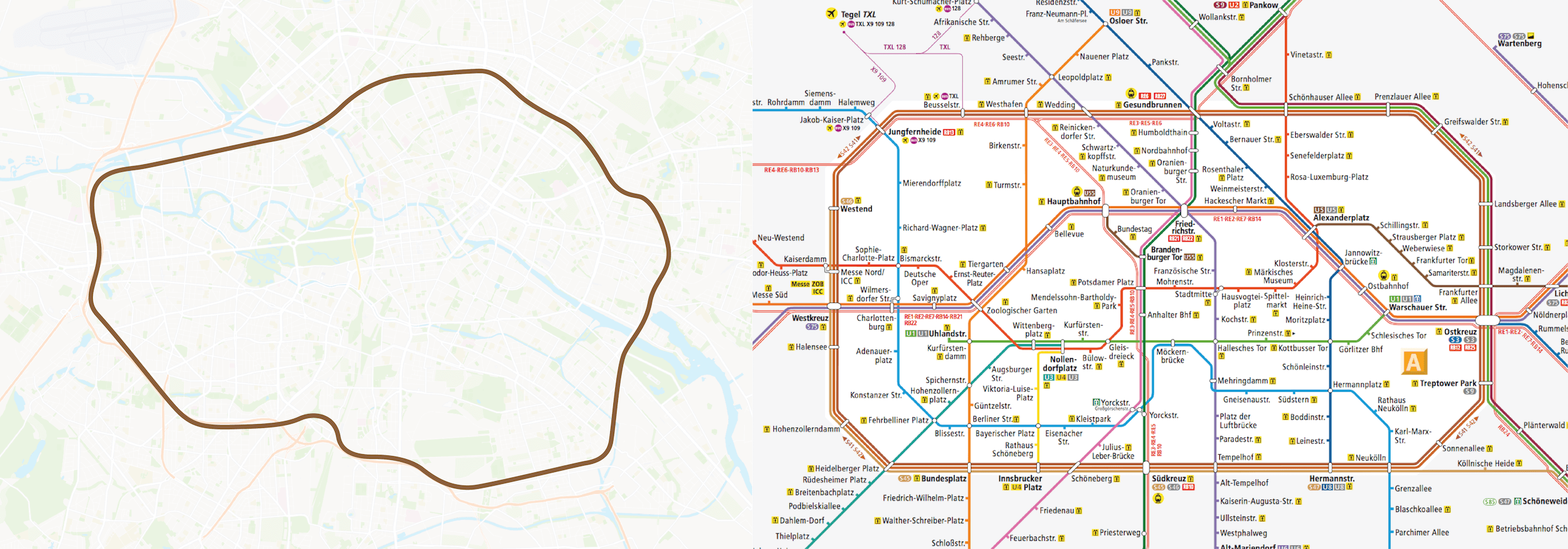
In Berlin, lines S41 and S42 are known as the Ring, even though, from a geographic perspective, the lines do not resemble a perfect circle. Also, the Ring is not drawn as a circle on the map, but is instead shown as a symmetrical octagon. What is most important is that, thanks to its geometric simplicity, this shape can be easily recognized on the map and forms the central tariff zone A. This is a great and super-convenient detail, even among other shortcomings of the Berlin map.
在柏林,S41和S42线路被认为是环状的,尽管从地理上这并不是一个正圆。所以在地铁线路图上看,这环状的线路没有被画成圆,取而代之的是一个对称的八角形。最重要的是,由于其几何简单,这种形状很容易在地图上被认出来,形成中央关税区A。这是一个柏林地铁线路图非常好的一个设计细节,即使存在着其他的不足之处。
But what about Paris? Paris is similar to these cities in its construction — the city can be broken down into two circles. One circle includes metro lines 2 and 6. The second of the two tram routes has still yet to form a loop, but construction is in progress. Still, it is safe to nominally say that the second circle is in fact the administrative border of the city, which happens to correspond to the tram line. However, looking at the official map, we cannot see the same clear-cut contour we see in other cities. The fact is that these contours simply merge with the other numerous lines.
那巴黎是怎样的呢?巴黎与这些城市的规划类似--这个城市可以被分为两个圆环。内环包括地铁2号和6号线。而外环线尚未连通,但线路正在规划建设中, 这条线可以说是这个城市的行政边界,和电车线路恰好一致。然而,回头看看官方地图,不像其他城市,我们在地铁图上看不到这样清晰的边界。这些轮廓就是简单和很多地铁线路合并在一起。
Also, when the geographic map is superimposed on the transit map, it is easy to see that on the official Paris metro map, lines 2 and 6 are considerably distorted and do not conform to the true geographic shape. If so, why not simplify these two lines and represent them as a recognizable shape, as in the cases of other cities?
当我们把地图叠加到地铁线路图上的时候,原来官方地铁线路图中的2号线和6号线与真实地图的形状也不符。所以,为什么不直接把这两条线简化成易于识别的图形,就像其他城市一样呢?
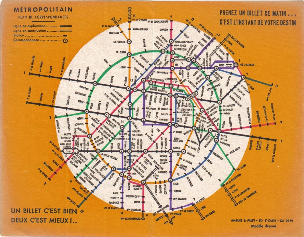
The only difference between Paris and other cities is that the ring would be formed from two lines.Before World War II, the metro ring was even divided into three lines. A portion of the present-day 6 (the lower portion of the ring) was a continuation of the 5 (the orange line in the image below). Plus, even back then, attempts were made to simplify the map using a regular circle, but they ended without much success. Ever since then, many designers have tried their hand at depicting a circular Paris.
巴黎和其他城市的唯一区别是,一个环形是由两条地铁线路组成。在第二次世界大战前,这个环形甚至被分为3条线路。今天6号线的部分(环形的下半部分)是五号线的延续(图片下方的橘色线路)。另外,其实在当时,人们就尝试用正圆来简化地铁线路图,但是他们没有成功。从那时起,许多设计师都在试图描绘一个圆形的巴黎。
An unofficial map dating back to 1936 (View large version)
Delving deeper into history, you’d discover that both of these Paris rings corresponded to the contours along which defensive walls were built in the city: the Farmers-General Wall (shown in blue in the image below) and the Thiers Wall (red), which themselves formed closed loops around the city. These days, the walls no longer exist, having been replaced by boulevards. These boulevards were then used to build some of the first metro lines, and a tram recently started operating along the outer ring. One particularly characteristic detail is that the metro lines tracing the location of former city walls are all above ground, with the exception of small underground sections. This allows riders to easily associate the metro ring with the above-ground portion of the city. In other words, if circular metro lines were shown as nominal circles on the map, then finding one’s desired station would be easier because a ring is easy to spot against a background of other numerous lines.
追溯历史,你会发现巴黎的环状轮廓和当时的护城墙相匹配:the Farmers-General Wall(下图的蓝色部分)和梯也尔城墙(红色),他们在城市周围形成了封闭的圈。时至今日,这些墙已经不复存在,被林荫大道取而代之。然后这些大道用来建造的第一条地铁线,最近开始运行外环线。一个特别有特色的细节是,大部分的地铁对应的地面位置和这些城墙相一致。这使得乘客很容易将地铁与城市的地面部分联系起来。换而言之,如果环形的地铁线路被简化成线路图上的正圆,那找自己的目的站就会比较容易,因为在纷乱的线路中,找一个圆是很简单的。
In 1992, RATP, the Parisian public transportation operator, replaced its logo with a circle and a silhouette of girl looking upwards. This symbol also represents the Seine flowing through Paris, which happens to be depicted as a circle.
Lately, this sign can be seen on every metro car, bus, ticket and transit map in Paris.
在1992年,RATP,巴黎的公交运营商,将图标替换成一个圆圈和一个向上看的女性侧脸轮廓。圆代表巴黎,侧脸轮廓代表流经巴黎的塞纳河。
最近,在巴黎的地铁、公共汽车、车票和公交地图上都可以看到这个标志。
Map Grid And Non-Geographic Depiction
The existence of two metro maps is appropriate for a city: one aligned with the city’s geography, and the other composed according to schematic representation of the lines. When a transit map is made on a city’s actual map, the lines correspond to real positions in the city, which is convenient to the extent that geographic precision is preserved. Such a map, however, has many disadvantages.
For example, here is the official map of the Paris metro integrated with a map of the city:
一般城市都会有两张地铁线路图:一张是把地铁线路直接画在城市地图上,另一张是根据线路抽象出一张图。当线路图画在城市地图上的时候,这些线路和真实的地理位置匹配,对于了解真实的地理位置是很方便的。见下图,然而,它也有诸多的弊端。
There is a lot of information to handle here, beyond just station names and maps of metro lines, overloading it to an unacceptable extent. The names of stations are tiny compared to the map as a whole and cannot be easily read; using a map like this on the run would be very difficult. Just imagine trying to puzzle out interchanges on this map if you were to find yourself in an unfamiliar city:
这张地图包含了很多信息,不仅仅有站名还有地铁线,信息超载严重。与整个地图相比,车站的名称很小,不容易阅读;在地铁运行颠簸时,阅读是非常困难的。想象一下,如果你在一个陌生的城市里,能否试着找出地图上的交汇处。
This is why complex maps are usually simplified and drawn to be more readable. To simplify, geography is sacrificed, allowing the map to be built according to a set of rules designed for readability and easier plotting of routes from point A to point B.
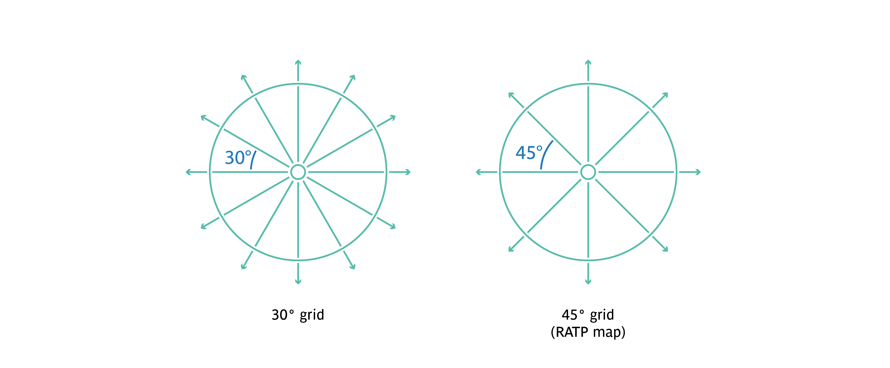
These rules include line color, point size, station designations and the coordinate grid used to plot the lines. A grid with an angle increment of 45 degrees is typically used. This is sufficient for most transit maps. Still, when a map gets more complex and the number of lines increases, the lines start getting tangled with one another, creating extra curves and misleading sections with stacks of parallel lines in which it is easy to get lost.
Transit maps must connect station location points in the simplest way possible, and the coordinate grid should assist this process.
After studying the problematic spots on the official Paris metro map, I concluded that the 45-degree grid is not the best solution for Paris. I instead believe that if a 30-degree grid is employed, the extra curves and other tricky sections could be eliminated by virtue of a larger number of axes.
这就是为什么复杂的地图通常被简化,需要更易读的原因了。为了简化,地理位置被牺牲了,我们允许根据一套以提高可读性,更容易从A点到B点绘制路线的规则来设计地图。
这些规则包括线条颜色、点的大小、站名和用于绘制线条的坐标网格。一般来说我们会使用一个角度步长为45度的网格。这对大多数地铁线路图是足够了。然而,当地图变得更复杂,地铁线路繁多时,线条开始相互缠结,就会产生多余的曲线,还会有很多平行的线路,很容易错乱。
地铁线路图必须以最简单的方式连接车站位置点,而坐标网应当在这一过程中发挥作用。
在研究巴黎地铁线路图问题后,我得出结论:45度的网格不是巴黎的解决方案。相反,我认为,如果采用30度网格,多余的曲线和其他棘手的部分可以借由更多数量的轴线来消除。
When I first started working on the map, I imagined that, despite all of the advantages of the 30-degree grid, I would still be unable to create a stable graphical form for the overall map. The vertical sections of some lines still attract more attention than they are intended to.
当我第一次开始绘制地图时,我在设想,尽管有30度网格的优点,但我还是没办法为整个线路图创建一个稳定的图形范式,因为有些线路的垂直部分实在是太过突出了。
At some point, I understood that the reason why the shape is unstable is my use of a vertical axis. When the 30-degree grid is used, so many axes are created that its most vertical catches the eye more easily than the others when one is viewing the image as a whole. Humans have evolved to constantly look for patterns in everything. In this way, even adults can imagine that clouds take on the shape of animals. Two windows cut into a blank wall next to each other attract our attention, and pure imagination transforms them into the eyes of an unknown creature.
In this case, the vertical axis draws attention and is likened to a foreign object on the image. This is why I decided to get rid of all verticals, but continued to work with the 30-degree grid.
在某种程度上,我明白了形状不稳定的原因是我使用了垂直轴线。使用30度网格时创建了许多轴线,当一个人把这张图作为一个整体观看时,它的垂直方向相对于他方向,更容易吸引眼球。人类已经进化为在任何事物中不断寻找规律。在这种习惯下,即使是成年人也能把云脑补成动物的形状。两扇窗户在一堵空白的墙里,也会吸引我们的注意力,然后被想象成一个未知生物的眼睛。
同理,在这种情况下,垂直轴太引人注意,容易被视作图像上的外来对象。这就是为什么我决定去掉垂直方向的轴线,但沿用30度的网格。
So, through trial and error, I found myself using the 30-degree grid, but without any vertical lines.
因此,通过反复试验和纠错,我使用了30度网格,但不包含任何垂直线。
Initially, I had wanted to simplify the complex shapes and limit the number of curves compared to the official map. By adopting a 30-degree grid, I was able to reduce the number of line curves by 2.5 times. Difficult interchange nodes were disentangled, thus becoming more easily understood.
我最初的想法,就是想简化官方的线路图,简化复杂的形状,减少曲线的数量。通过采用30度网格,我成功地将曲线的数量减少2.5倍。把线路的节点分离出来,让线路图更加容易理解。
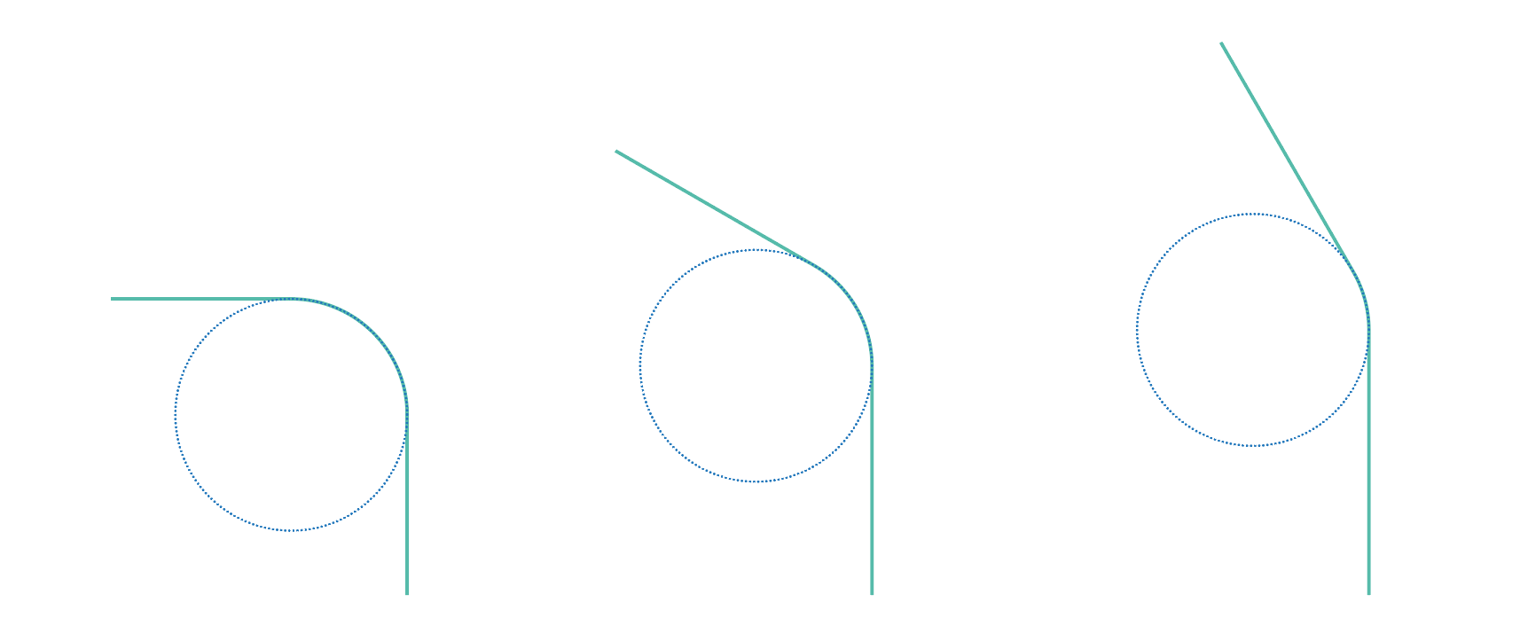
Another requirement directly related to the coordinate grid is changing the radii of the line curvature. Many transit designers pay no attention to this detail, but it is very important to producing an attractive graphical image of transit lines. Let’s start with three angles, 90, 120 and 150 degrees:
另一个和坐标网络直接相关的就是改变线的曲率半径。很多交通设计师并不关注这个细节,但是这对公交线路能否产生识别性是非常重要的。让我们从三个角度开始,90, 120和150度:
If we smoothed them out with the same curvature radius, these lines would not look so similar. The bend of the 90-degree angle would be too smooth (about one-quarter of the curve), while the 150-degree angle would be so sharp that little difference would be perceived in the angle without rounding.
如果我们用相同的曲率半径使这些角度平滑一些,这些线条看起来没那么统一。90度角的弯曲过于平滑(大约是曲线的四分之一),而150度角会非常尖锐,在没有圆度的情况下,角的变化不大。
Let’s conduct a short experiment. Take a drinking straw and start bending it — first lightly, then all the way to an acute angle. Notice that when the bend is minor, the curvature radius is quite large, and when the angle is acute, the curvature radius shrinks. This observation is useful when building transit maps. The sharper the bend, the more noticeable it becomes, so the curvature radius should be smaller. If the curvature is insignificant, then there would be no point in sharply accentuating it, so the radius would increase in this case.
让我们做一个简单的实验。拿起吸管,开始轻轻弯曲,然后一直到锐角。请注意,当吸管没那么弯的时候,曲率半径是相当大的,当弯曲度变大后,曲率半径缩小。在绘制地铁线路图时,这种观察是有用的。吸管越弯曲,曲率越小。如果弯曲幅度没那么大,没必要让它显得那么尖锐,所以曲率半径这时候要增加。
Note the bends on this map:
If a line follows its route and only bends 150 degrees, then the turn would be smoothed out by a streamlined curve. But if attention needs to be brought to a sharp turn (a 60-degree angle), then the curvature radius could be reduced, and the line bent more aggressively, catching the eye when the user is planning a route. Such curves are natural for the eye, because they approximate the physical curves encountered in a real environment.
(It is rather easy to guess the principle of radius change depending on the angle of the bend. I am fully confident that many readers can solve this simple geometric equation with alacrity.)
如果一条线随着它的线路只是弯曲到150度,那这个转弯应该被流线型曲线平滑展现。但如果一个急转弯(60度角)需要引起注意,那曲率半径可以减少,弯曲得更积极,这样更容易引起规划路线的用户注意。这种曲线对眼睛来说是自然的,因为它们接近真实环境中遇到的物理曲线。
(根据曲率的变化,很容易猜到曲率半径变化的原理。我相信很多读者可以轻松解出这个简单的几何方程。)
In the process of its composition, the new map adopted a layout quite dissimilar from the official version. Therefore, I decided to stylize it with colors that would be more familiar to Parisians.
在构图过程中,新路线图采用了与官方版本不同的布局。因此,我决定在颜色上,也采用巴黎人更熟悉的样式。
I also repainted the background to match the style of the official map, so that it would be better associated with Paris.
To a certain extent, I dislike this solution because the map loses its sharpness, due to the yellow background. On the other hand, it looks much closer to the official map that so many have become accustomed to — a rather clever perception trick.
Also, to make the map easier to understand, I reduced it to the major geographic principles of the Paris transit system, including the official colors of lines, fonts and graphical designations.
我也重新绘制了路线的背景图,来匹配原有官方的路线图样式,这样也与巴黎有更多的联系。
在某种程度上,我不喜欢这个解决方案,黄色的背景让图片没那么清晰。但另一方面,它看起来更接近大家已经有一定熟悉度的官方路线图—- 这是一个相当聪明的感知技巧。
此外,为了使地图更易于理解,我尽量简化到与巴黎公交系统的主要地理规范保持一致,包括线条、字体和图形名称的官方颜色。
In tourism capitals, it is very important to direct visitors to where the main sights are located, using directions and maps.
The color brown is typically used to depict walking proximity to noteworthy sights. To create icons for Paris’ most famous sights, I used a square, regular grid after approximately calculating that, when printing the map in A3 format, the printer would be able to precisely print each cell.
To make the sights more noticeable in smaller format, they must first be simplified. This turned out to be a rather fascinating process. The principal features of each building are singled out from their photographs. These could include recognizable windows and doors, bas-reliefs or sculptures. Naturally, an icon need not be very precise, but should only adhere to the shape and general image of the building. Similar to how the exact borders of the city or ring-shaped transport lines cannot be reproduced from memory, it is easier to just remember a more simplified, concise version of them, just as it is impossible to recall the precise number of sculptures on the facade of Notre Dame de Paris. An entire picture simply cannot fit into the average memory. People only remember general features: two towers, a circular window in the center, three arches below. This is sufficient to make an icon memorable and not to overload it at the same time. Icons with excessive detail in a small format look messy on a map.
作为一个旅游城市,用方向和地图把游客指引到主要景点所在地是非常重要的。
棕色通常用来描述步行到著名景点的距离。为了给巴黎最著名的景点创造图标,我使用了正方形的规则网络,并大致计算出,当我以A3尺寸打印时,打印机可以精确地打印出每个单元格。
为了让景点在小规格地图里依然引人注目,首先必须简化它们。结果证明这是一个相当迷人的过程。我们从他们的照片中提取主要的建筑特征点。包括可辨识的门窗,浮雕或者雕塑。当然,一个图标不一定需要很精确,但能在形态上高度概括一个建筑物。这就像我们很难记住一个城市具体的边界或环状的交通线路,但我们能轻松记住一个更简单、更简洁的轮廓,所以我们同样也无法回忆起巴黎圣母院正面雕塑的精确数量。一个完整的图片根本不适合一般的记忆。人们只会记住一般的特征:两个塔楼,中心的一个圆形窗户,下面有三个拱门。这些特征足以让一个图标难忘,但同时也不会信息量过大。图标本身很小,如果有太多细节,在地图上会看起来很凌乱。
But while many sights can be easily depicted based on a photo of the facade, there are exceptions. For example, a sports stadium or Disneyland would need to be drawn differently.
Yet stadiums are not always recognizable when viewed from the side, and they rarely possess any characteristic features or unique architectural forms. However, when viewed from the top, they are easily perceptible because the inside can be depicted as a football field. Also, people more frequently see stadiums on TV when they are filmed from a bird’s-eye view.
Places like Disneyland are more easily recognizable not from any architectural image, but from their symbols. For Disneyland, that is Mickey Mouse.
虽然很多景点的正面照片,都很容易转化为一个图标,但也有例外。例如,一个体育场或者迪士尼乐园就需要一些不同的技巧。
因为体育场的侧面通常不具有识别性,而且它们也很难具有任何特征或独特的建筑形态。但是,从上往下看,它们就是可识别的,因为内部是一个足球场的样子。同时,人们也更常在电视里看到体育场的高空俯拍视角。
像迪士尼这类地方的特征点就不会来自于它的建筑形象,而是它们独特的标志。对于迪士尼乐园来说,米老鼠是当之无愧的。
To avoid making the map look chaotic and to give it a certain graphical rhythm, I needed to create connections between the similar placement of parallel lines on the map itself.
为了避免使地图看起来混乱,并给它一个特定的图形节奏,我需要在地图上平行线的相似位置之间建立联系。
Take a look at these four fragments. It is not difficult to notice that the distance between two parallel lines in any of the four cases is the same. This was done on purpose as a way to “calm” the graphical elements on the map. In other words, this is another addition to the rules of the grid and radii of curvature. But here, no rule is ever set in stone. There may be several types of indentations between parallel lines, and their selection is directly related to the overall artistic theme.
Below, I used rectangles to highlight the places where the same space is left between parallel lines. They set the rhythm of the image.
看下这四个截图。不难看出,这四种情况中,两条平行线间距的距离是一样的。这么做的目的是为了地图上图形元素有秩序。换而言之,这是对网络规则和曲率半径的另一个补充。但在这里,没有一条规则是一成不变的。我把平行线之间的距离分为几种不同的类型,距离的选择就是看整体的美感。
下面,我用矩形标注出了平行线的位置,相同的颜色表示平行线之间的距离是相同的。他们决定了线路图的韵律感。
Naturally, this is just a sample of the equal distances. There are far more of them, and their interdependencies might be far more complex.
For example, elegant graphics can be created by manipulating the curves of river and transit lines. The image on the left shows the river and RER C line (yellow) on the map, and the one on the right shows their actual geographic position.
当然,这只是用相同距离来创造和谐的例子。还有更多情况,他们之间的相互依存可能更复杂。
比如,通过操纵河流和地铁线的曲线来创造更优雅的图形。左边的图片显示了地图上河流和RER C线(黄色),右边显示了它们实际的地理位置
A few paragraphs above, we covered the rules for smoothing angles and established certain principles, but the design also allows for exceptions to even the strictest rules. The curves of the RER C line do not follow the rules of the other bends. Here, the curvature radius of angles is formed following the river’s general rhythm, because the shape of the line depends largely on the route of the Seine. Therefore, the RER C line simply clings to the river and moves along with it.
在上面的几段文字中,我们涵盖了平滑角的规则,并确立了特定的规范,但即使是最严格的设计规则也允许例外。RER C线就没有遵循其他的弯曲规则。这里,它的曲率半径是根据河流的韵律形成的,因为线的形状很大程度上取决于塞纳河的路线。因此,RER C线是紧贴着这河流的。
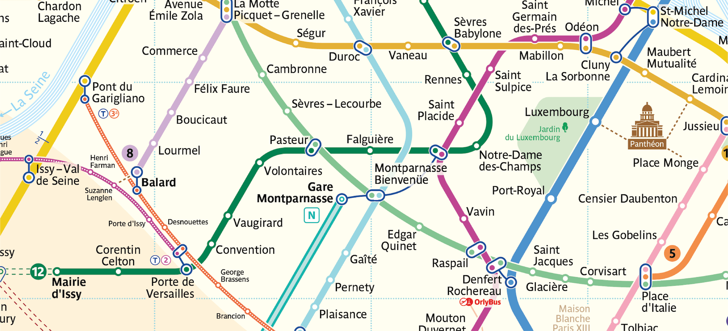
This article cannot cover each individual fragment of the map, so I will limit myself to a description of just one of the most complex sections and how it developed. The topic of focus here is the Montparnasse-Bienvenüe junction. I believe this example does a lot to explain the general process of working on this map.
First, I attempted to bring the lines together in such a way that the transfer would be depicted as a single point where the lines of each transfer station are intersecting.
这篇文章不能覆盖到地图绘制的每个片段,所以在这里,我只描述创作过程中遇到最复杂的一个部分,以及它是如何发展的。这就说到了 Montparnasse-Bienvenüe这个连接点。我相信这个例子能够很大程度上说明这个地图绘制的一般过程。
首先,我尝试把这些线连在一起,这个换乘站就被描述成一个点,每个换乘站的地铁线路是相交的。
But the resulting crossings were not visually pleasing, and the straight lines failed to meld with the ring line.
但由此产生的交叉,在视觉上不那么令人愉悦,直线和环线无法融合。
Ultimately, I tried several versions to solve this issue, and also attempted to draw sections of the straight lines as ring lines.
最后,我尝试了几个版本来解决这个问题,并试图把直线段画成环形线。
At some point, the junction even started to come into its own. I felt like I could just stop there, but after digging through the old maps of Paris and talking to city residents, I understood that the transfer as a whole could not be narrowed down to just a single point. The heart of the matter was that, in the past, the Montparnasse-Bienvenüe station did not yet exist; rather, there were actually two different transfer junctions, Gare Montparnasse and Bienvenüe. Between them there was no transfer. So, the common name, Montparnasse-Bienvenüe, was adopted only after they had been joined. And the distance between these stations is expansive, so transfers here are quite long and inconvenient.
在某个时点,连接点的设计基本已经成型。我觉得我可以停下来了,但在调研了巴黎的老地图,和当地居民交谈后,我明白换乘站其实不能简化成一个点。问题的核心就在于,在过去,Montparnasse-Bienvenüe站并不存在;相反,这里其实有两个不同的换乘站,Gare Montparnasse和Bienvenüe。他们之间是不能换乘的。所以,Montparnasse-Bienvenüe这个名字只是在他们被连起来后才沿用起来的。即使是这样,他们之间的换乘距离也很长,换乘时间很长,也不方便。
If there were no alternative options to building the route, they could just be left as they were, with no attention paid to the fact that transferring here takes so long. But when looking at the official map, many passengers travelling on the 12 (dark green) see the very first crossing with the 6 (light green) at the Montparnasse-Bienvenüe station, even though they could take a much shorter transfer at Pasteur if they continued a little further. But the eye fails to catch this detail.
如果没有其他的选择来规划路线,他们只会像左边那张图那样,不小心就在Montparnasse-Bienvenüe换乘了很长时间。当他们看下官方线路图,很多乘客就是乘坐12号线(深绿色)然后直接在 Montparnasse-Bienvenüe站换乘6号线(浅绿色),即使他们可以在坐远一点到Pasteur在换,而且花的时间更少。但是眼睛很难捕捉到这个细节。
Thus, on my map, I divided up the transfer visually to hint at the long transfer time.
因此,在我的地图上,我把一个换乘站分离开,视觉上暗示他的换乘时间。
After another dozen iterations, I arrived at the following result:
It seems wrong to break the transfer into two parts connected by a communication line, but after studying all of the details, it is evident that a map should first and foremost help passengers map the quickest routes.
将换乘站分成两部分,这似乎是错误的,但是在研究所有细节之后,很显然,地图的首要目的是帮助乘客找到最快的路线。
Development Perspectives 发展前景
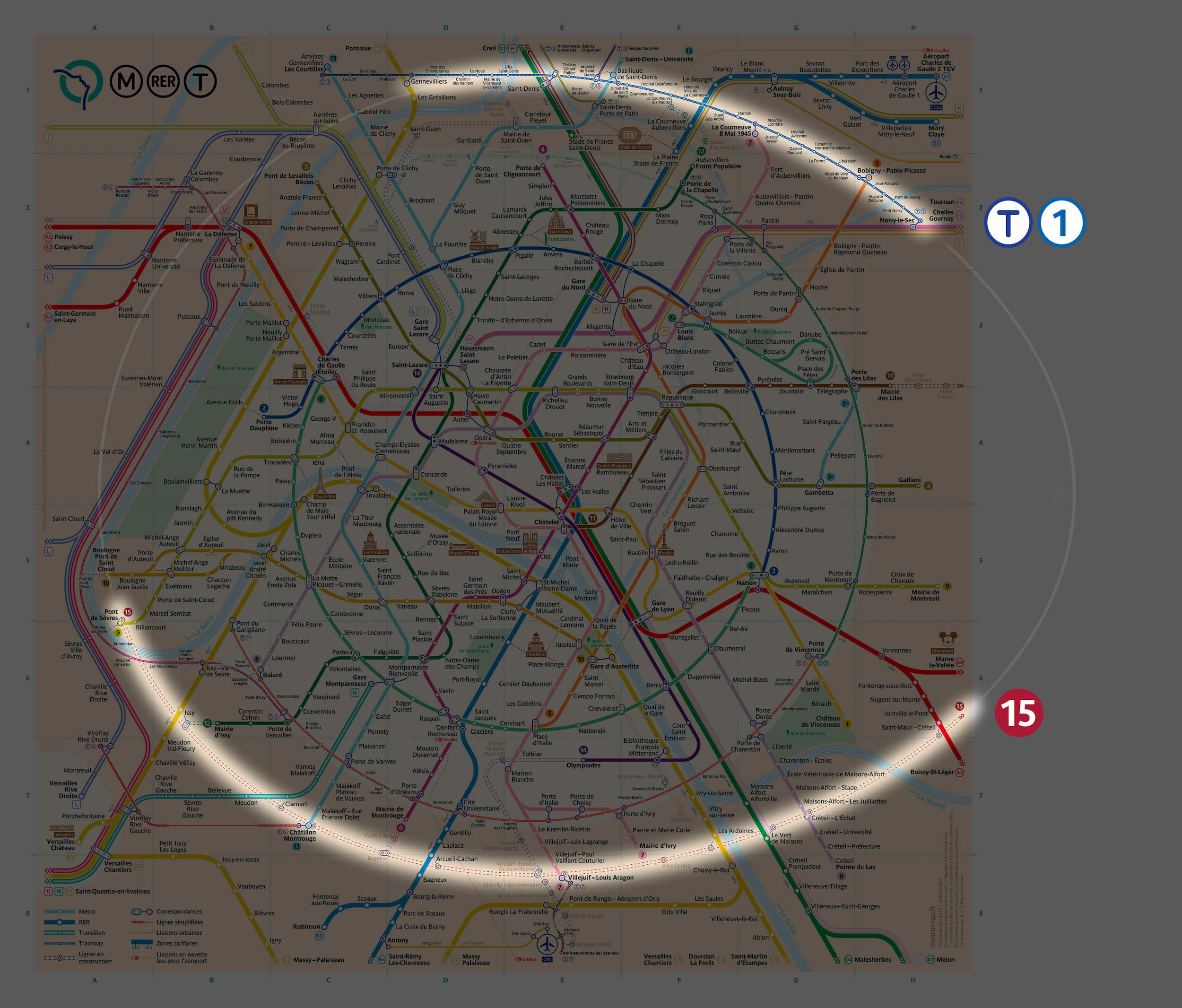
When developing a new map for a rapidly growing city, studying plans for further construction is also a must. My idea for ring-shaped lines enjoys significant support from Paris’ future urban development plans. Another ring-shaped line will be made into a loop around Paris within the next 15 years. This time, the new ring will be made up of just the 15 line.
当为一个快速发展的城市,开发一张新的地铁线路图时,研究它进一步的规划也是必须的。我的环形设计得到了巴黎未来城市发展计划的验证。在未来15年内,另一条巴黎的环状线将建成。这一次,这个新的环形将是地铁15号线。
I ultimately chose not to allocate much precious space to the new ring before it has even been built. So, I compressed it into the shape of an egg and only included the section that will be operational by 2024, the lower semi-ring.
To integrate the new semi-ring visually with the rest of the map, I repeated the shape in the already existing tram line T1, and I mirrored the semi-ring shape to the north.
我最终选择不把宝贵的空间给新的环线,因为它还没建成。所以,我把它暂时压缩成一个鸡蛋形,留下2024年之前能够实现的下半条环线。
为了把新的半环和剩下的线路图结合起来,我复用已经存在的有轨电车T1线的形状,并把半环镜像到了北边。
Aside from the 15, serious changes are scheduled for both the RER E and 14, which will be extended beyond city limits. Therefore, when working on my map, I immediately took them into account. All lines currently being built are shown by dotted lines.
除了15号线,重要的规划同样包括RER E线与14号线,他们将扩大城市的边界。因此,当我在绘制线路图的时候,我们将他们纳入考虑范围内。所有在建的线路都用虚线表示。
In my effort to create a new Paris metro map, I saved the intermediate versions so that I could return to them if I deviated too far in a certain direction for any reason. I created mockups of the map every 15 to 30 minutes by saving them to a new file. By the time the first version was completed, I had over 800 files saved.
I then combined all of these files into a video to show more concisely what went into the creation of the new map. You can now see how each node evolved as the project went on.
在我努力创建一个新的巴黎地铁地图时,我保存了中间版本,这样如果我偏离了某个特定方向,我可以退回版本。我每15到30分钟,会创造一个线路图原型,并把他们保存到新的文件里。到第一个版本完成时,我保存了超过800个文件。
然后我将所有这些文件剪辑成一个视频,更简洁地展示了创建新地图的过程。你可以看到每个节点在项目中,是如何演化的。
The map is still not recognized as official, but I have over one hundred reports of satisfied users after its publication in June.
I hope that the Paris public transportation operator will take my experience into account when updating the official map. I also intend to expand the map and supplement it with new stations as soon as they open. The latest version of the map is available on my website.
地图还没有被官方认证,但在六月发布后,我收到了超过一百份用户满意的报告。
我希望巴黎公共交通管理人员在更新官方地图时,可以采纳我的经验。我还打算扩大地图,并在新的站点开通后及时补充。可以访问我的网站查看线路图的最新版本 my website。
本文由Smashing Magazine独家授权异步社区发布简体中文版。版权所有 禁止转载或建立镜像。

